
COVID-19 Dashboard (Internal)
“When the going gets tough, the tough get going.” – Billy OceanOver the past few weeks, we have seen our clients utilize our ClearPoint Strategy software in a way we never imagined – to provide them with the insight they need to see themselves and their communities through the COVID-19 pandemic. By pulling together their best practices, we’ve developed an internal dashboard example that may also work for you and your organization.
Healthcare - Processes

It is important to know the status on all of the processes and supplies available so that you can provide high quality healthcare services to your citizens. The exact measures will be different depending on your organization. Most data sets we’ve seen include measures related to the availability of testing and supplies and the capacity of the healthcare system. Creating a visual like those above with the actual number and target will make it easy to see where you may be falling low on supplies.
Outcome Measures

It is also important to make sure you are measuring the outcome measures to see how the initiatives you’ve taken on and your access to supplies are affecting your ability to handle the crisis. Across the board we are seeing measures like number of cases, number of people hospitalized, and the percent of people who have recovered.
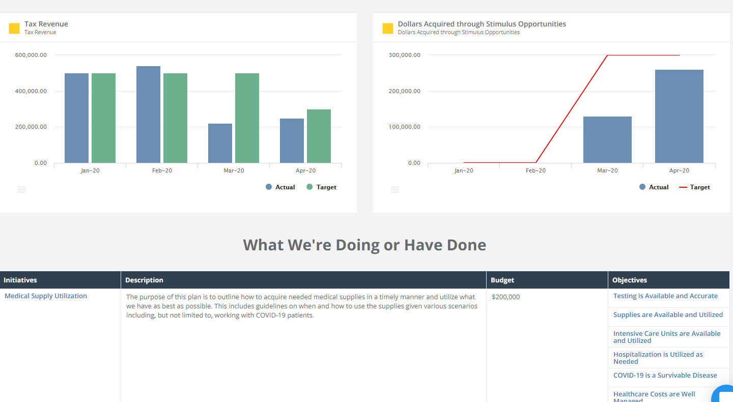
Economic Data

COVID-19 is not only having an impact on people’s health, it is also affecting organizations economically. Many people are asking how, so having the data to support your decisions and answer questions is important. Charts like the one above can be broken down to show costs in different areas so that you can drill down into the details and see the true economic impact.
COVID Project Information
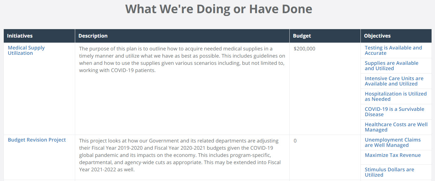
Measures are great, but your staff may want to coordinate all of the projects that are ongoing as a result of COVID. You can track your projects in a summary report like the one above, and drill down for detailed reports. You can link your projects to related measures or objectives so it is easy to find the data you need, when you need it.
Key Features
- Dashboards and charts, segmented by category.
Looking at a lot of charts all at once can leave people overwhelmed and confused, especially if they don’t have the right context. By breaking up your visualizations into different segments, your audience can focus on what is important to them for the decisions they need to make right now.
- Status indicators showing the current status of each measure and project.
Use the stop-light method so that your team can quickly and easily see where progress has been made and where they should focus their efforts. With ClearPoint, green, yellow, and red status indicators can be set up to automatically evaluate based on how your actual data compares to the targets you have set.
- Drill-down capabilities to allow users to get additional context and detailed data.
Your dashboard should provide an overview of each of your measures and projects. They will not all be applicable to everyone, so make sure your team can drill down to get the information they need.
Intended Audience
This dashboard is intended for agency-wide and departmental leadership, who are working together to see their community through the crisis. Anyone contributing to decision making should have access to the dashboard so they have context on the status of relevant data and projects.
.webp)

