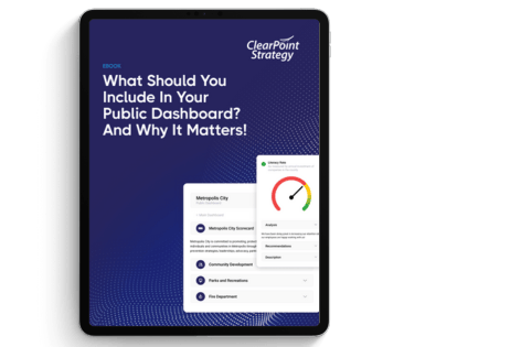
Learn KPI dashboard best practices from over 20,000 strategic plans. From choosing the right metrics to executive-ready layouts, this guide covers everything.
- Name the audience, its decisions and its review cadence before choosing metrics. A dashboard built to display data gets skimmed once and ignored.
- Show three to five North Star metrics up front. People process 5-9 items at once; put supporting indicators below and the rest behind a drill-down.
- Feed every metric you can from its source system. Manually updated dashboards go stale by month three, and leadership stops trusting them.
- Use color only for status. Keep green, yellow and red consistent, and invert them for lower-is-better metrics like response time.
- Place each KPI under the objective it advances. Start from the 200+ KPI examples, then review the set quarterly as strategy shifts.
The Problem with Most KPI Dashboards
Most KPI dashboards fail because of their design, not their data.
Teams spend weeks configuring dashboards with dozens of charts, tables, and metrics. The result is a screen packed with numbers that nobody uses. Leadership skims it once, asks a question the dashboard cannot answer, and goes back to making decisions based on gut feeling and hallway conversations.
The cause is almost always the same. The dashboard was built to display data, not to drive decisions. Organizations that understand the difference consistently outperform those that do not.
At ClearPoint Strategy, we manage performance data for over 20,000 strategic plans across government agencies, healthcare systems, higher education institutions, financial services, and utilities. This guide collects the practices we have seen work again and again. You can apply them whether you are building your first dashboard or redesigning an existing one.
Best Practice #1: Start with Decisions, Not Metrics
The most common mistake in dashboard design is to start by asking what you should track. Ask instead: "what decisions does this dashboard need to support?" Every dashboard should serve a specific audience making specific decisions at a specific cadence. A city manager reviewing quarterly performance needs a different view from a department head managing weekly operations.
Before selecting a single metric, answer these three questions:
Who is the primary audience? A dashboard designed for city council members looks nothing like one built for an IT operations team. Council members need strategic outcomes and trend lines. Operations teams need real-time status indicators and exception alerts.
What decisions will they make? If your dashboard supports quarterly business reviews, the metrics should help leadership decide where to allocate resources, which initiatives to accelerate, and which to pause. If it supports daily operations, it should surface anomalies that require immediate action.
How often will they look at it? A dashboard reviewed weekly needs different granularity than one reviewed monthly. Weekly dashboards benefit from short-term trend lines and week-over-week comparisons. Monthly and quarterly dashboards should emphasize longer-term trajectories and progress toward annual goals.
Starting with decisions cuts the metric bloat that kills most dashboards before they launch.
Best Practice #2: Limit Metrics to What Matters
Research from cognitive psychology, notably George Miller's foundational work on cognitive load, consistently shows that humans can effectively process 5-9 pieces of information at once. Yet most dashboards display 30 or more metrics on a single screen.
The best KPI dashboards we have seen follow a strict hierarchy:
Tier 1 — North Star Metrics (3-5). These are the metrics your organization would track if you could only track five things. For a city government, this might be resident satisfaction score, budget variance, employee engagement index, infrastructure condition rating, and public safety response time. These go front and center.
Tier 2 — Supporting Indicators (8-12). These metrics explain why the North Star metrics are moving. If resident satisfaction drops, supporting indicators like parks maintenance ratings, permit processing times, and code enforcement responsiveness help diagnose the cause.
Tier 3 — Operational Detail (available on drill-down). Everything else lives behind a click. Department-level data, individual initiative status, and granular operational metrics should be accessible but not visible on the primary view.
Executives get what they need at a glance, and analysts and department heads can still dig into the detail.
Best Practice #3: Use Consistent Visual Language
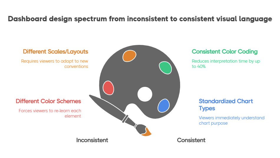
A dashboard where every chart uses a different color scheme, scale, or layout forces viewers to re-learn how to read each element. Cognitive load goes up, comprehension goes down.
Establish a visual language and apply it universally:
Color means status, not decoration. Use green, yellow, and red consistently to indicate on-track, at-risk, and off-track. Reserve blue or gray for neutral/informational elements. Never use color purely for looks. Every color should communicate something. The Nielsen Norman Group's research on dashboard design confirms that consistent color coding reduces interpretation time by up to 40%.
Direction matters. Up arrows, trend lines, and sparklines should always follow the same convention: green-up means improvement, red-down means decline. For metrics where lower is better (like response time or cost per unit), invert the color logic so that the viewer's intuition stays consistent.
Standardize chart types by use case. Trend over time gets a line chart. Comparison across categories gets a bar chart. Part-to-whole relationships get a donut or stacked bar. Current status gets a gauge or scorecard card. When viewers see a line chart, they should immediately think "this is a trend" without reading the title.
Organizations that use ClearPoint's performance management framework get built-in visual standards that enforce these conventions automatically, so dashboard builders have less design work.
Best Practice #4: Build for the Quarterly Business Review
The quarterly business review (QBR) is where dashboards prove their worth or expose their weaknesses. The ICMA (International City/County Management Association) has long advocated for data-driven review cycles as the backbone of effective local government management. A dashboard that looks great in a design meeting but cannot answer leadership's questions during a QBR is broken.
Design your dashboard to answer the five questions that come up in every QBR.
If your dashboard can walk through these five questions without anyone needing to open a spreadsheet or dig through email threads, you have built something that will actually get used.
Best Practice #5: Connect KPIs to Strategy — Not Just Operations
The most valuable dashboards visually connect day-to-day metrics to strategic objectives. Without that connection, you have an operational monitoring tool. That is useful, but not transformative.
A Balanced Scorecard approach works well here. It organizes metrics across four perspectives (Financial, Customer, Internal Processes, and Learning & Growth) that map operational KPIs to strategic themes.
For local governments, ClearPoint's framework supports a modified version.
When a department head sees their permit processing time KPI sitting under the "Service Delivery" strategic objective, which in turn connects to the "Community Outcomes" goal of resident satisfaction, the dashboard tells a story. It explains why that metric matters and why improving it is worth the effort.
Best Practice #6: Automate Data Collection (or Your Dashboard Dies)
A dashboard that requires manual data entry is a dashboard with an expiration date. The first month, someone dutifully updates every metric. The second month, a few get skipped. By month three, the dashboard shows stale data, leadership stops trusting it, and the entire investment is wasted.
Automation is a survival requirement. The most successful implementations we have seen follow this order:
Automate first: Any metric that exists in a structured system (ERP, HRIS, CRM, financial software, 311 systems) should feed into your dashboard automatically via API integration or scheduled data import.
Semi-automate second: Metrics that require human judgment but follow a regular cadence (like initiative status updates or qualitative assessments) should use structured forms with reminders and escalation workflows.
Manual last: Only metrics that truly require manual collection, like data from external partners or one-time assessments, should rely on manual entry. Even these should have automated reminders and data validation rules.
ClearPoint's platform handles all three tiers, which is why organizations using it for performance management in government keep their data current through automated feeds rather than manual logins.
Best Practice #7: Review and Refine Quarterly
Your dashboard should evolve as your strategy evolves. The metrics that mattered in January may be irrelevant by July if strategic priorities shift. Build a quarterly dashboard review into your planning process. Regular refinement keeps the dashboard relevant and stops the slow decay that turns most dashboards into digital wallpaper.
Putting It Together
Start with the decisions, keep the North Star metrics few, automate what you can, and review the set every quarter. If you are not sure which metrics belong on your dashboard, start with our library of KPI examples by function and industry.
Common questions
How do you choose the right KPIs for a city government dashboard?
Start with your strategic plan. Every KPI should trace directly back to a strategic objective approved by your council or governing body. Then apply three filters: Is this metric measurable with data you can actually collect? Is this metric actionable? Is this metric meaningful to the decisions your leadership makes?
What is the best layout for an executive KPI dashboard?
Executive dashboards should follow an inverted pyramid layout: the most critical metrics (strategic outcomes) at the top as large scorecard cards with status indicators, supporting trend charts in the middle row, and detailed tables or drill-down links at the bottom. This layout mirrors how executives consume information — headline first, context second, detail on demand.
How often should you update a KPI dashboard?
Update frequency should match your decision cadence. Strategic dashboards reviewed in quarterly business reviews need monthly data refreshes at minimum. Operational dashboards used in weekly team meetings should update daily or in real-time. The critical principle is that data should never be staler than the decision cycle it supports.
Can you use Excel for a KPI dashboard?
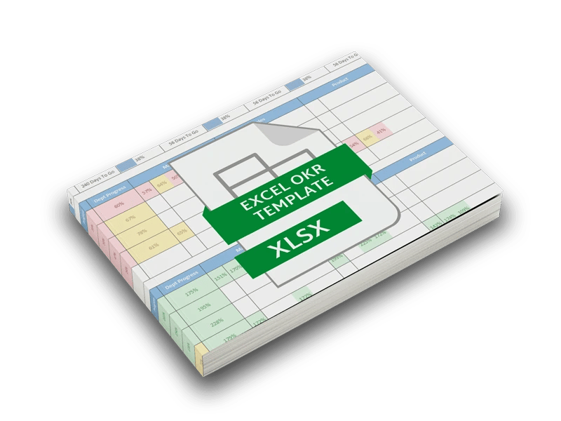
Excel can serve as a starting point for small teams tracking a handful of metrics, but it becomes a liability as your organization grows. Spreadsheet-based dashboards break down in three predictable ways: manual data entry introduces errors and delays, version control becomes chaotic, and there is no built-in mechanism to link metrics to strategy or track initiative progress.