Book a 30-min demo

Free tool ·

All

Dashboard template builder: what to show each audience, and how it looks built

Pick who the dashboard is for, choose from 54 local-government measures (plus healthcare, higher education and utilities), and watch it take shape in a ClearPoint preview. Export the PNG, PDF and spec.

Free to use. No account. Email only to export.
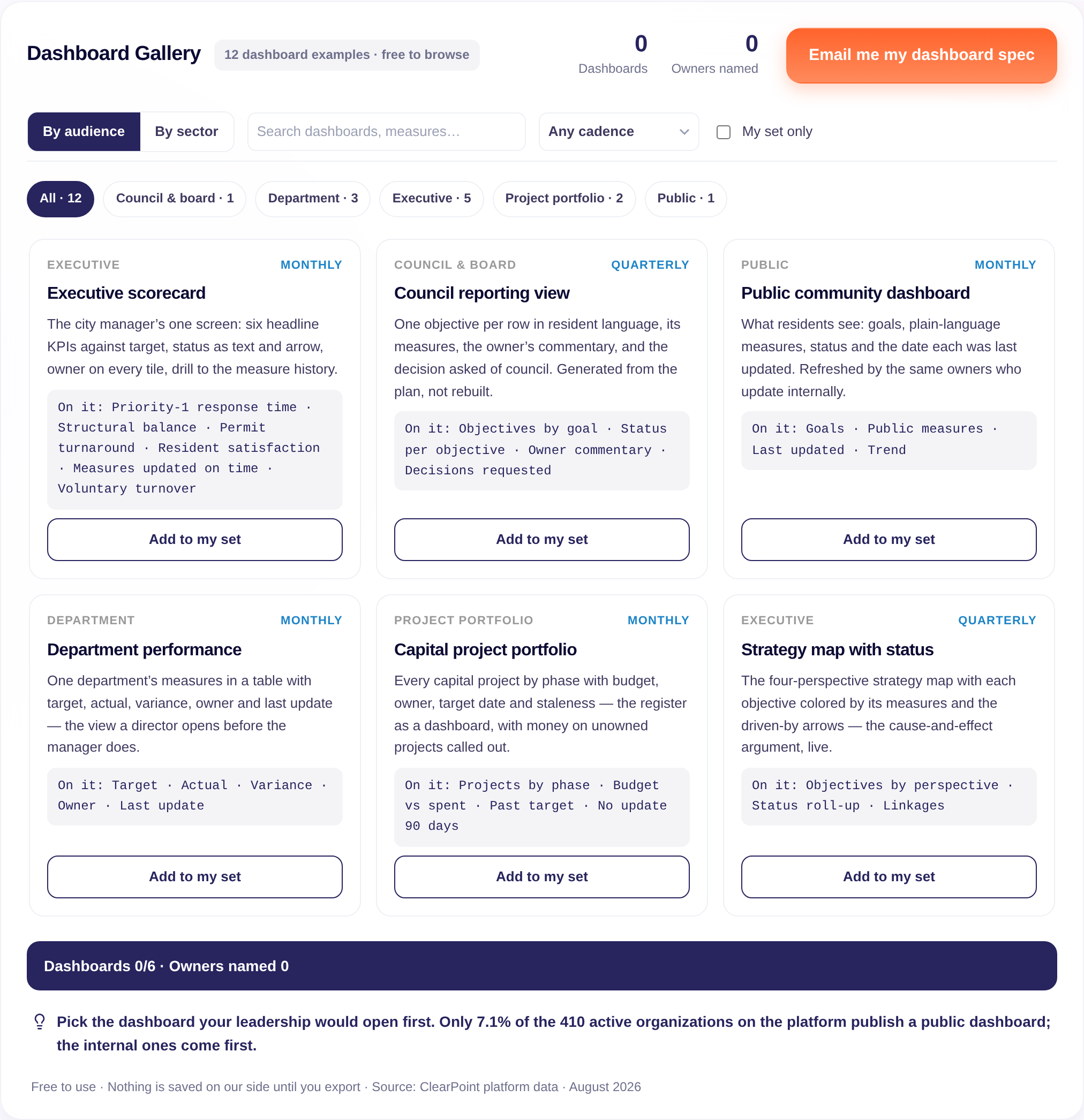
Preview of the tool and its export

Show the full register as text

The measure library, as text. 54 local-government measures in six goal areas, each with its unit, direction and definition. The Designer adds 12 measures each for healthcare, higher education and utilities.

Public Safety

  • Emergency Response Time (min, lower is better): Average time from a 911 call to arrival of first responders on scene.
  • Police Priority-1 Response Time (min, lower is better): Average response time for high-priority police calls requiring immediate dispatch.
  • Violent Crime Rate (per 1,000 residents, lower is better): Reported violent crimes (assault, robbery, homicide) per 1,000 residents.
  • Property Crime Rate (per 1,000 residents, lower is better): Reported property crimes (theft, burglary, auto theft) per 1,000 residents.
  • Crime Clearance Rate (%, higher is better): Percentage of reported crimes solved or closed through investigation.
  • Traffic Safety: Fatalities per 100,000 (per 100,000 residents, lower is better): Annual traffic fatalities normalized to population, including pedestrians and cyclists.
  • Police Staffing vs. Target (%, higher is better): Actual police officers as a percentage of the department's authorized complement.
  • Emergency Services Staffing Level (%, higher is better): Percentage of authorized firefighter and EMS positions filled.
  • Domestic Violence Response Compliance (%, higher is better): Percentage of domestic violence calls responded to within policy guidelines.

Infrastructure & Public Works

  • Road Condition Index (score (0-100), higher is better): Composite index rating surface condition of all municipal roads; 100 is excellent, 0 is failed.
  • Pothole Repair Time (days, lower is better): Average days from reported pothole to completed repair.
  • Water Main Breaks (per 100 miles, lower is better): Annual water main breaks normalized to miles of pipe in the system.
  • Water Quality Compliance (%, higher is better): Percentage of water samples meeting EPA and state safety standards.
  • Permit Processing Time (days, lower is better): Average business days from permit application to issuance or denial.
  • Infrastructure Projects On-Time (%, higher is better): Percentage of capital infrastructure projects completed by planned completion date.
  • Public Transit On-Time Performance (%, higher is better): Percentage of scheduled transit trips arriving within 5 minutes of schedule.
  • Streetlight Repair Time (days, lower is better): Average days from reported streetlight outage to repair completion.
  • Water/Wastewater System Uptime (%, higher is better): Percentage of time water and wastewater systems operate without major outage.

Economic Vitality

  • Business License Processing Time (days, lower is better): Average business days from application to business license issuance.
  • Commercial Occupancy Rate (%, higher is better): Percentage of available commercial space (retail, office) occupied.
  • New Business Formations (year-over-year %, higher is better): Year-over-year percentage growth in new business licenses issued.
  • Small Business Growth Index (%, higher is better): Net growth rate of businesses with 1-50 employees.
  • Net Job Creation (count, higher is better): Net new jobs created in the city annually.
  • Unemployment Rate vs. Regional (percentage points, lower is better): City unemployment rate minus regional average; negative is better.
  • Commercial Building Permits (count, higher is better): Annual commercial construction permits issued, signaling development activity.
  • 311 Service Request Resolution Rate (%, higher is better): Percentage of non-emergency requests resolved within published service-level target.
  • Business Confidence / Retention (%, higher is better): Percentage of surveyed businesses reporting intent to remain or expand locally.

Community & Quality of Life

  • Resident Satisfaction Score (%, higher is better): Percentage of residents rating municipal services as satisfactory or better in annual survey.
  • Parks & Recreation Program Participation (%, higher is better): Percentage of residents (all ages) enrolled in city-sponsored programs.
  • Community Event Attendance (count, higher is better): Annual attendance across all city-sponsored community events and festivals.
  • Library Usage per Capita (visits/year, higher is better): Annual library visits and circulations per capita.
  • Voter Turnout (Municipal Elections) (%, higher is better): Percentage of registered voters who vote in municipal elections.
  • Youth Program Enrollment (%, higher is better): Percentage of school-age children (K–12) enrolled in city youth programs.
  • Annual Volunteer Hours (count, higher is better): Total hours of volunteer service contributed across city departments annually.
  • Housing Affordability Index (ratio, higher is better): Median home price / (median household income x 3); above 1.0 is unaffordable.
  • Resident Safety Perception (%, higher is better): Percentage of residents who feel safe walking in their neighborhood at night.

Parks, Recreation & Environment

  • Tree Canopy Coverage (%, higher is better): Percentage of city land covered by tree canopy.
  • Park Accessibility (10-Min Walk) (%, higher is better): Percentage of residents within a 10-minute walk to a city park.
  • Miles of Accessible Trails (count, higher is better): Total miles of maintained walking, biking, and nature trails.
  • Recreation Program Attendance (count, higher is better): Annual attendance across all city recreation programs and classes.
  • Air Quality: Good/Excellent Days (%, higher is better): Percentage of days with good or excellent air quality (AQI 0–100).
  • Environmental Compliance Rate (%, higher is better): Percentage of environmental permits and regulations met without violation.
  • Green Space per Capita (sq ft, higher is better): Total public green space (parks, natural areas) per resident.
  • Park Maintenance Satisfaction (%, higher is better): Percentage of park users rating maintenance quality as good or excellent.
  • Environmental Sustainability Index (score (1-5), higher is better): Composite score of recycling rate, renewable energy use, and conservation initiatives.

Fiscal Responsibility & High-Performing Government

  • General Fund Balance (months, higher is better): Unrestricted reserves expressed as months of operating expenditure.
  • Budget Variance (%, lower is better): Absolute difference between budgeted and actual spending; lower variance indicates better control.
  • Revenue Collection Rate (%, higher is better): Percentage of budgeted tax and fee revenue actually collected.
  • Employee Turnover Rate (%, lower is better): Annual voluntary and involuntary separations as a percentage of workforce.
  • External Audit Findings (count, lower is better): Number of material findings or deficiencies noted in annual independent audit.
  • Capital Projects On-Time Delivery (%, higher is better): Percentage of capital projects completed by planned delivery date.
  • IT System Uptime (%, higher is better): Percentage of scheduled availability of critical city IT systems.
  • Permit Revenue Collection Rate (%, higher is better): Percentage of issued permits with fees collected.
  • Administrative Cost Ratio (%, lower is better): Percentage of total budget spent on administrative overhead.

How to cite / reuse the Dashboard Designer

Format: Measure · Unit · Direction · Definition
Source: ClearPoint Strategy Dashboard Designer — https://www.clearpointstrategy.com/free-tools/dashboard-gallery

7.1%

of 410 active organizations publish an embedded public dashboard · 9.5% in local government · Aug 2026

128

measures the median organization tracks, across 15 scorecards · n = 593 · Sept 2026

83%

of metrics have no owner assigned at all · 272,360 of 327,582 · Jan 2026

52.0%

of 10,046,276 status records carry no result · Jan 2026

ClearPoint platform data · 2026 snapshots

What is a strategy dashboard?

A strategy dashboard is a live view of objectives, measures and initiatives against target, built from the tracked plan so it updates whenever owners update their measures. Good ones show status as text and arrow, the owner and the last-updated date on every tile. Only 7.1% of the 410 active organizations on the ClearPoint platform publish a public one (August 2026).

Case studies

How teams put this to work

Published ClearPoint customer stories, matched to this tool.

Arapahoe County

Local government · Colorado's first county

Problem

The county needed to show residents its progress on three goals, Service First, Fiscal Responsibility and Quality of Life, across every department and elected office.

Implementation

Align Arapahoe stores each department's measures in ClearPoint for monthly or quarterly reviews. In 2018 the county launched a public dashboard that pulls data directly from its account.

Impact

A public scorecard updated from the source

Residents can follow measures such as the share of county services they can use without visiting a county building.

Read the Arapahoe County story →

City of Germantown

Local government · Tennessee

Problem

Excel and disconnected tools left departments with different report formats, slow reviews and no single place to compare data.

Implementation

About 2,000 hours of citizen input shaped Germantown Forward 2030. ClearPoint tracks its measures, produces the quarterly Business Plan reviews with each director and powers the Community Dashboard.

Impact

2019 Malcolm Baldrige National Quality Award

Germantown became one of only four municipalities ever to win the award, with much of its application data exported from ClearPoint.

Read the Germantown story →

City of Coral Springs, Florida

Local government · Baldrige Award recipient

Problem

The city needed its strategic plan, which it calls its operational DNA, tied to the budget and visible to residents.

Implementation

The plan is linked to the budget in ClearPoint, and a public Community Dashboard shows progress on key initiatives, budget allocations and performance metrics.

Impact

Sterling Award

Automation moved staff time from administration to strategy, and department success stories tracked in ClearPoint supported the city's Sterling Award.

Read the Coral Springs story →

Why dashboards get opened once

What makes a dashboard people actually open?

Three things on every measure: status as text and arrow, the owner’s name, and the date it was last updated. With those, a dashboard is a view on live measures that stays current. Without them, someone rebuilds it as a slide each month. On the ClearPoint platform, 83% of metrics have no owner assigned (January 2026), which is why so many dashboards get rebuilt by hand and read once.

How is an executive dashboard different from a public dashboard?

Audience and language. An executive dashboard shows the six to eight measures leadership decides on, with drill-through to history. A public dashboard shows goals and a few measures per goal in resident language, with a plain definition and the last-updated date on each. Only 7.1% of the 410 active organizations on the platform publish an embedded public dashboard, 9.5% in local government (August 2026).

7.1% publish a public dashboard. The ones that last are refreshed by the owners who update the measures.

How many measures should a dashboard have?

Fewer than the organization tracks. The median organization tracks 128 measures across 15 scorecards (n = 593, September 2026). An executive view works with six to eight, a council report with eight to twelve rows, a department table with ten to twenty. The Designer warns you past each range.

Customer stories on this page

Arapahoe County · City of Germantown · City of Coral Springs

Questions people ask before they start

Is the Dashboard Designer free?

Yes. Pick an audience, choose measures and see the preview without an account. Email is asked only when you export the PNG, PDF and CSV.

What should an executive dashboard include?

Six to eight headline measures, each with a target, status as text and arrow, a trend, the owner, and the date it was last updated.

What should a city dashboard for residents include?

Goals in resident language, three to five measures per goal, a plain-language definition of each, the trend over years, and the date each number was last updated. Only 7.1% of the 410 active organizations on the ClearPoint platform publish an embedded public dashboard (9.5% in local government, August 2026).

How many measures should a dashboard have?

It depends on the audience: six to eight for an executive view, eight to twelve rows for a council report, ten to twenty for a department table. The median organization on the ClearPoint platform tracks 128 measures across 15 scorecards (n = 593, September 2026), far more than any single audience reads.

Dashboard vs. scorecard: what is the difference?

A scorecard organizes objectives and measures inside a framework such as the Balanced Scorecard or OKRs. A dashboard is the view on top of it, shaped for one audience.

What do I get when I export?

A PNG and a printable PDF of the dashboard you designed, plus a CSV spec with each measure’s owner, target, recommended chart and definition.

Are these real client dashboards?

No. The preview uses a fictional organization and illustrative sample values. Client dashboards are shown in a demo, with permission.

Method

How the numbers are built

What the tool contains

A library of 54 local-government measures with definitions, plus 12 measures each for healthcare, higher education and utilities, compiled by ClearPoint’s strategy team. Preview values are illustrative and use a fictional organization. No client data is shown.

Platform figures

Public dashboards: 410 active organizations with an embedded public dashboard flag, August 2026; 7.1% overall, 9.5% in local government. Measures: DISTRICTSTATS, September 8, 2026, 593 organizations, medians. Ownership: January 2026 archive, 327,582 metrics.

What the numbers do not say

The measure ranges per audience are practice guidance from ClearPoint’s strategy team. They are not a measured optimum.