A KPI dashboard can tell the story of an area in your company.
What is a KPI Dashboard?
A key performance indicator (KPI) dashboard is a single page or single screen view of multiple charts that tell the story of the subject matter you’re building your dashboard for.
- If it’s a safety dashboard, it’s telling the story of what makes your organization safe.
- If it’s a quality dashboard, it’s telling the story of what makes your factory high-quality.
- If it’s a strategy dashboard, it’s telling the story of what your company’s strategy is.
Note: KPI dashboards and scorecards can often be confused with one another. (This article further explains the differences between the two.)
The Components Of A KPI Dashboard
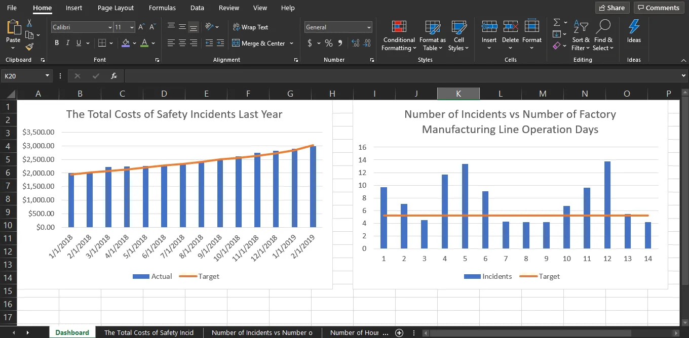
A typical KPI dashboard template has between five and 15 charts on it relating to a particular subject. For example’s sake, we’ll focus on “safety.” The safety dashboard might live on a factory floor and show the number of days since the company last had an incident. Of the KPI dashboard examples above, the charts for the safety dashboard might include:
- The cost savings from not having incidents.
- The number of days since the manufacturing line has been running.
- The number of hours worked.
- The number of safety briefings.
- The number of hours off due to a safety incident.
- The total costs of safety incidents in the last year.
The key to creating a stellar KPI dashboard is to tell the story as clearly as possible. Also:
- Add RAG status indicators or some other visual of the target performance in every chart. For example, if you can tell whether 10 days without an accident is a new record—or the minimum threshold—it may help drive the right behavior from employees.
- Add qualitative information to the dashboard. Some advanced dashboards have text that is updated on a regular basis to highlight a success story or explain a drop in performance. Not everyone understands the implication of a chart moving in a particular direction, so this kind of explanation might help get everyone on the same page.
How Do You Select the Right KPIs?
Beyond establishing a KPI dashboard definition, you need to understand the type of dashboard you’re building.
Is it a dashboard to share information or drive behavior?
- KPIs that share information can lead employees to be better-informed about their job. Ideally, most of the measures should be within your control (safety, strategy, etc.), but there will be some dashboards that show information not within your control. For example, this could be information about financial markets (e.g., a dashboard of the financial markets showing Dow, S&P, Nasdaq, bond prices, mortgage rates, the price of oil, etc.) or a map showing your customers the miles of pipe across a city.
- KPIs that drive behavior can help motivate employees toward an ultimate outcome. For example, driving behavior may lead employees to make a safety briefing—particularly if their quarterly bonus depends upon dashboard results more directly.
Secondly, you need to determine the audience for the dashboard.
Your KPIs should be tailored to what’s relevant for that audience.
- KPIs for team leaders or mid-level managers focus on employees and operations. Using our previous example, a safety dashboard for factory managers will likely contain KPIs that relate to worker and team performance levels, and how those performance metrics impact costs. The dashboard could include number of workplace incidents, production times by project, and even KPIs tied to team bonuses. KPIs for managers would likely also roll up to display averages, making it easy to compare teams or departments to set standards.
- KPIs for senior leadership provide a high-level snapshot of revenue, costs, and profit. These KPIs should help leaders make decisions about the strategic direction of the business, versus being tactical, “boots on the ground” metrics. Again using the safety example, a factory’s executive team could have KPIs for accidents, high-risk tasks, inspection failures, and other similar issues appear on a red-alert dashboard if they fall below expected levels. This serves to elevate issues that might affect revenue so they can be addressed immediately.
Claim your FREE eBook on 53 important customer KPIs for enhanced customer satisfaction here
5 Basic Steps To Building A KPI Dashboard Excel Template
1. Gather the data you want to use to build the chart
Your data will likely have two axis, one for time and the other for the element you are tracking. If it is easier for you, put each measure on a different worksheet.
2. Highlight that data and select a chart that applies
Excel recommends charts on the “Insert” tab of the ribbon at the top of Excel.
3. Take your chart and copy and paste it into a separate worksheet
You can do this for each of the charts you’re building for your KPI dashboard in Excel. The new sheet where you place these charts will become your dashboard.
4. Resize your charts depending on the importance of each chart
Your big charts should be the most important and your small charts should be the least important. To do so, simply grab the corner of each chart.
5. Ensure that your Excel dashboard template is appropriately sized for the place you’re going to be displaying it
If your KPI dashboard will be displayed on a television monitor with a particular resolution, you need to ensure it won’t be grainy. If it’s being displayed on a computer monitor in portrait mode, you’ll want to rearrange the dashboard to accommodate.
The Challenges Of Building KPI Dashboards In Excel
Excel is a great tool, and we recommend using it for standalone projects or as a place to experiment when your organization is just starting to build its strategic reports. But once you know what you want to measure and need to report on repeated basis (monthly or quarterly) with a solid management reporting process in place, Excel can present some serious challenges.
You’ll know you’ve outgrown Excel when these issues become nightmares:
- Copying and pasting from other worksheets creates data errors. Most organizations have multiple tabs within multiple worksheets. As you add more KPIs and information over time, the number of documents and tabs within those documents also grows. Juggling all the data inevitably results in typos and incorrect data.
- Making all the manual updates takes too much time. On a monthly basis alone, this could include inputting new data, recreating charts, adding analysis, and deleting old information. As your reporting grows, these tasks can become incredibly time consuming.
- Reporting formats are hard to customize. Excel is not built for visuals and graphics. You can create custom charts, but you have to update every single chart when you make a change. In other words, Excel doesn’t offer flexible, repeatable templates that can be customized.
- Using more than one program creates inefficiencies. Excel is rarely your final destination, which means you have to copy, paste, and reformat information in PowerPoint or Word. This not only takes extra time and risks more data errors, but also adds more programs to navigate when creating your final report or dashboard. And if you need to make changes, you need to do it in Excel...and PowerPoint...and Word. This adds additional time and room for error.
- Emailing files creates version control issues. Excel doesn’t allow for multiple users in an online, real-time environment, so Excel documents are emailed and stored in shared drives (or on desktops!). Inevitably, people create different versions of the same document and you have to sort out which is the most accurate, up-to-date file. This takes hours of time. It’s not uncommon for old data to be used in dashboards for stakeholders, which impedes the decision-making process.
These are just the top five challenges we’ve seen customers face with Excel. You can read more in this article.
Dedicated KPI Dashboards Software: An Alternative To Excel
While Excel can be good or bad depending on your organization’s stage of growth, know that you always have options. ClearPoint’s strategic planning and reporting software gives you a powerful alternative when you need a repeatable process, automated tools, and real-time data. Some of the top benefits of using ClearPoint for your reporting and KPI dashboards include:
- Data only needs to be entered once. All charts, reports, dashboards, and any other places the data appears will automatically update when information is added or changed. This saves time and drastically reduces errors.
- Templates are easy to customize. It’s a snap to make changes to a template and then apply those changes globally across all charts and dashboards. This allows you to tailor and brand your reports to suit your organization, creating a more professional, consistent look and feel. This may be especially important if your organization shares its dashboards externally.
See ClearPoint Strategy in action! Click here to watch a quick DEMO on the software
- All reports can be created in ClearPoint and then exported. You’ll have one system to house all your data and strategic reporting. Users can log in to browse dashboards (permitting access rights), add data, or export reports to PDF, PowerPoint, or even HTML. You can create an unlimited number of dashboards or reports, which can all be protected by administrative controls.
- Quantitative and qualitative information can be presented in tandem. ClearPoint gives you the ability to display charts next to qualitative information, providing context and historical data to give the numbers meaning. This deeper analysis helps audiences make informed decisions—for example, they can see month-over-month or year-over-year trends, whereas Excel just overwrites past information.
- Data and charts can be used in multiple locations. Add the same chart to several KPI dashboard templates; or create multiple charts with the same data set to highlight different aspects of the information for different audiences. Again, you only need to enter data once and it can be automatically pulled into any chart or dashboard.
- Dashboards can be easily filtered to show exactly the data you need. Instead of relying on an Excel expert to create specialized reports, ClearPoint makes it simple for any user to filter dashboards to display the right information for the right audience—like the red-alert dashboard for leadership teams we mentioned earlier. Dashboards can be created on the fly and are updated in real time, so data is always current.
.webp)
Building KPI Dashboards in ClearPoint is More Effective
Remember, dashboards can be very beneficial for your organization. Define your dashboard’s purpose and audience, pick the KPIs, and create a story that helps drive the intended behavior in your organization at a budget that makes sense for you.
If you’ve outgrown Excel or are in need of a more robust solution for your KPI dashboards, consider ClearPoint. Our strategy software will save you time, eliminate errors, and consolidate all reporting efforts within a single system. See it live to better understand how ClearPoint can work for you.
Book your FREE 1-on-1 DEMO with ClearPoint Strategy
FAQ:
What are the major problems in healthcare?
The major problems in healthcare include:
- High Costs: The rising cost of medical services, treatments, and medications.
- Access to Care: Limited access to healthcare services in rural and underserved areas.
- Chronic Diseases: Increasing prevalence of chronic conditions such as diabetes, heart disease, and obesity.
- Workforce Shortages: Shortages of healthcare professionals, including doctors, nurses, and specialists.
- Aging Population: The impact of an aging population on healthcare resources and services.
- Quality and Safety: Ensuring high-quality care and patient safety across all healthcare settings.
What problems can AI solve in healthcare?
AI can solve various problems in healthcare, including:
- Diagnostics: Improving the accuracy and speed of disease diagnosis through advanced image and data analysis.
- Personalized Treatment: Tailoring treatment plans to individual patients based on predictive analytics and patient data.
- Operational Efficiency: Streamlining administrative tasks, such as scheduling and billing, to reduce costs and improve efficiency.
- Predictive Analytics: Identifying potential health risks and predicting patient outcomes to enhance preventive care.
- Drug Discovery: Accelerating the development of new drugs by analyzing vast datasets and identifying potential compounds.
How do you solve problems in healthcare?
To solve problems in healthcare:
- Implement Technology: Adopt advanced technologies like telemedicine, AI, and electronic health records to improve efficiency and care.
- Enhance Workforce Training: Provide ongoing training and development opportunities for healthcare professionals.
- Expand Access: Increase access to healthcare services through policy changes, expanded coverage, and mobile clinics.
- Focus on Prevention: Emphasize preventive care to reduce the incidence of chronic diseases and improve overall health outcomes.
- Engage Stakeholders: Collaborate with patients, healthcare providers, and policymakers to address key issues and develop sustainable solutions.
What are ethical problems in healthcare?
Ethical problems in healthcare include:
- Patient Privacy: Ensuring the confidentiality and security of patient health information.
- Informed Consent: Making sure patients fully understand the risks and benefits of treatments and procedures.
- Resource Allocation: Fairly distributing limited healthcare resources and services.
- End-of-Life Care: Navigating ethical decisions regarding life-sustaining treatments and palliative care.
- Equity: Addressing disparities in healthcare access and treatment based on socioeconomic status, race, and other factors.
What are wicked problems in healthcare?
Wicked problems in healthcare are complex issues that are difficult to define and solve, often involving multiple stakeholders and interconnected factors. Examples include:
-Healthcare Inequity: Persistent disparities in healthcare access and outcomes across different populations.
- Chronic Disease Management: The multifaceted challenge of preventing and managing chronic diseases on a large scale.
- Healthcare Financing: Balancing the need for affordable care with sustainable funding models.
- Mental Health: Addressing the widespread and deeply rooted issues surrounding mental health care and stigma.
- Global Health Crises: Managing responses to global health emergencies, such as pandemics, which require coordinated efforts across borders and sectors.