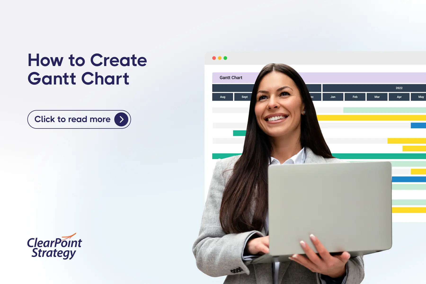
Get answers like this one, first.
Google’s AI Overviews now favor the sources you choose. Add ClearPoint once, and our research shows up in your AI answers — badged and prioritized.
Add ClearPoint as a Preferred SourceFree · one click · applies only to your own Google results.
Utility dashboard performance reports are meant to give teams a clear view of how well things are going.
Utility dashboard performance reports are meant to give teams a clear view of how well things are going. They’re supposed to bring together key data, show trends, and give decision-makers updates they can trust. But sometimes what looks like a helpful tool ends up hiding problems. When a performance dashboard isn’t doing its job right, progress gets delayed, and teams are left second-guessing their next move.
- Inaccurate data is the first red flag: clean-looking charts can hide manual entry errors, missed updates, or broken syncing.
- Outdated KPIs quietly mislead teams, because a dashboard tracking last year's targets no longer reflects today's priorities or pressures.
- Generic templates fall short for utilities; a one-size-fits-all dashboard often buries the metrics that actually matter to your operation.
- Poor adoption makes even a polished dashboard worthless when teams find it overwhelming, hard to navigate, or unreliable.
- Integration gaps cause data loss and duplication, skewing reports and complicating the daily operations the dashboard is meant to support.
Running a utility comes with a lot of moving parts. Energy use, water systems, service quality, budgets—all of that needs steady tracking. If any part of the dashboard has inaccurate or missing info, that can throw off the entire picture. Spotting early signs that a report might be misleading is important if you want to avoid making decisions based on the wrong data. Let’s take a closer look at some of the red flags that can show up in these reports.
Inaccurate Data Representation
Not all dashboards tell the full story. Some charts look clean and organized but don’t match what’s actually happening. Sometimes the issue is caused by manual data entry or missed updates. Other times, it’s a deeper issue like poor syncing between spreadsheets and the software.
Bad data leads to bad decisions. If your dashboard says operations are on track, but in real life there are service interruptions or budget imbalances, teams will be slow to act or may take steps in the wrong direction. The more people rely on a dashboard, the more damaging the effects become when the data inside it isn’t trustworthy.
Often this shows up when:
- Numbers don’t match up with monthly reports
- Categories are mislabeled or too vague
- Graphs are updated later than the source data
- Old numbers stay on display with no indication that they're outdated
Maintaining real-time syncing is one way to fix this, but that requires proper setup and upkeep. Just importing data once a month usually isn’t enough when things like usage and costs change daily or weekly. Review how and when your data gets collected, and check if there’s a set process in place for confirming what ends up in the dashboard.
Outdated Metrics And KPIs
Sometimes the dashboard reflects what mattered two years ago, not what’s important now. That’s a problem. As goals shift and pressure points change, your KPIs need to follow. If a team is still tracking outdated performance targets, their work will feel off-target, and it becomes harder to hold departments accountable.
A few examples of outdated KPIs in utility dashboards:
- Tracking power usage per residential unit when the focus has shifted to large-scale commercial growth
- Reporting call response time when digital support has taken the lead
- Highlighting quarterly energy audits from a time when monthly reviews are now required
When KPIs stay stuck, reports can look “healthy” on the surface, but they miss what the utility really cares about now. It’s helpful to revisit your list of metrics at least once a year, or whenever goals change. Get input from field and planning teams, not just IT teams. Frontline staff usually know when metrics are pointing to the wrong things.
Keep in mind that just adding more KPIs doesn’t help either. More isn’t better if the extra data clutters the dashboard or distracts from actual priorities. Choose a lean set of useful, relevant metrics and leave the rest off to reduce noise.
Lack of Customization Options
Utility dashboards often fall short when they stick to generic templates instead of accommodating specific needs. A one-size-fits-all approach means the dashboard might not highlight the metrics that truly matter for your utility. This can result in missed opportunities to optimize operations and improve service delivery.
Here's why customization is key:
- Allows prioritization of metrics that align with specific operational goals
- Provides flexibility to adjust and focus on new objectives as they evolve
- Enhances the clarity of reports by removing unnecessary data
Imagine a water utility that's focused on minimizing waste. If their dashboard is cluttered with data about energy efficiency rather than water loss metrics, they'll miss crucial insights. Custom dashboards can highlight areas where improvements are possible, driving more focused decisions.
Tuning dashboards to the right specifications ensures a clearer path to meeting organizational goals. Customize your dashboard by working with teams across different departments to gather insights. This collaborative approach helps make sure the features needed are included and nothing important is left out.
Poor User Adoption
A beautifully designed dashboard is worthless if no one uses it. Low user engagement often stems from dashboards that feel overwhelming or aren't user-friendly. If team members struggle to find the information they need or fear data errors, confidence in the tool dwindles.
Here's how to enhance user adoption:
1. Provide Training: Educate staff on using dashboards effectively. Quick, regular training can demystify usage and highlight benefits
2. Prioritize User-Friendly Design: Simplify navigation and reduce clutter. Dashboards should guide users to action with intuitive layouts
3. Encourage Feedback: Regularly solicit input from users to make improvements. Address the areas that cause frustration or confusion promptly
A utility company that embeds training in onboarding processes and encourages ongoing feedback finds that staff embraces the dashboard quicker, resulting in more strategic decision-making. When people are comfortable using the system, the tool is more likely to become integral to daily operations.
Integration Issues
Dashboard integration issues can disrupt the flow of data, creating inefficiencies and inaccuracies. Dashboards that don't sync seamlessly with other systems may lead to data loss or duplications, which skews reports and complicates operations.
Effective integration should:
- Enable real-time data updates without manual intervention
- Allow easy cross-referencing between systems and dashboards
- Reduce the risk of errors by automating data transfers
A utility might try to connect their existing billing system with their performance dashboard. Without proper integration, discrepancies can arise in financial reporting, undermining trust in the data presented.
Ensuring dashboards integrate smoothly with existing infrastructure helps maintain accuracy and consistency. Consider investing time to plan these integrations carefully, anticipate challenges, and collaborate with IT experts to support successful implementation.
Making Dashboards Work Harder for Your Utility
Taking control over the performance of utility dashboards involves acting on potential red flags as they arise. By addressing issues associated with inaccurate data, outdated KPIs, customization needs, user engagement, and integration, utilities can foster improved operational efficiency.
Improving dashboards empowers utilities to enjoy greater transparency and enhance strategic planning. Accurate, relevant, and user-friendly dashboards help managers identify trends and make more informed decisions effortlessly. Continuous improvement in these areas leaves utilities stronger, more connected, and equipped to meet future demands.
To ensure your utility operates at peak efficiency, overcoming dashboard challenges is just the beginning. Learn how a tailored dashboard for utility strategic planning can support your team in aligning priorities and tracking progress in real time. At ClearPoint Strategy, we're committed to helping you make informed decisions and streamline your utility management.
Frequently Asked Questions
What are the most common red flags in a utility dashboard?
The recurring warning signs are inaccurate data representation, outdated KPIs, lack of customization, poor user adoption, and integration issues. Each one quietly erodes trust in the numbers, so spotting them early keeps reports reliable and decisions grounded in what is actually happening across the utility.
Why does inaccurate data show up on dashboards that look fine?
A dashboard can look clean and organized yet still misstate reality. The cause is often manual data entry or missed updates, and sometimes a deeper problem like poor syncing between systems. The chart looks finished, but it no longer matches what is actually happening on the ground.
How do outdated KPIs hurt utility performance reporting?
Outdated KPIs make a dashboard reflect what mattered two years ago instead of today. As goals shift and pressure points change, the metrics need to follow. When teams keep tracking stale targets, their work drifts away from current priorities while the report still appears healthy.
Why do generic dashboard templates fall short for utilities?
Generic templates apply a one-size-fits-all layout that ignores a utility's specific needs. Without customization, the dashboard may not highlight the metrics that truly matter, leaving important signals buried. Tailoring views to the utility's real priorities is what turns a template into a useful decision tool.
What causes poor user adoption of a dashboard?
Low adoption usually comes from dashboards that feel overwhelming or are not user-friendly. When team members struggle to find what they need, or worry the data contains errors, they stop relying on it. A beautifully designed dashboard that no one trusts or uses delivers no value.
How do integration issues affect dashboard accuracy?
When a dashboard does not sync cleanly with other systems, data can be lost or duplicated. That disrupts the flow of information, skews reports, and complicates operations. Reliable integration keeps a single, consistent version of the data moving between tools instead of fragmenting it.